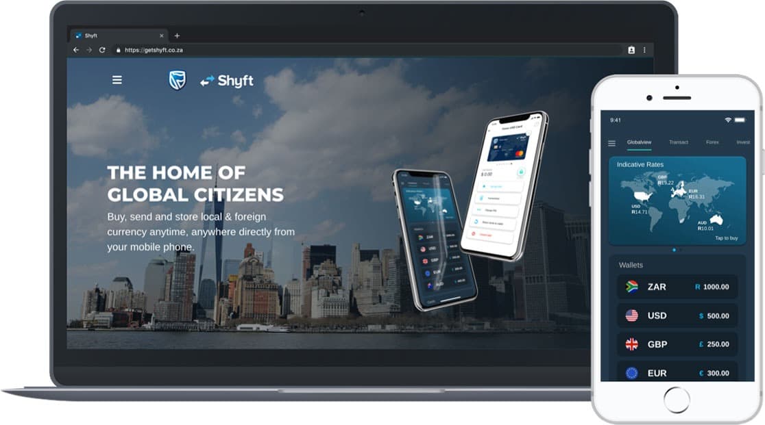
SHYFT
- The Process
- The Designs
Standard Bank tasked us with creating a vision for their Foreign Exchange application; Shyft as well as updating the app for a more extensive user base. This brief included conducting user research, designing a new UI and UX, creating a road map for future features as well as developing them.
Shyft has since received Special Honours in the Global Finance 2020 Innovators Awards.
User Experience:
- Discovery Research
- Client Scoping
- Desktop Research
- Expert Stakeholder Interviews
- Workshop facilitation
- Ideation
- User Research Interviews
- Concept Validation Interviews
- Concept Acceptance Testing
- Usability Testing
- Feedback loop management
User Interface:
- Wireframing
- App Design
- Interaction Design
Content:
- UX Writing
- Marketing Content
- Writing
Project Management:
- Stakeholder Management
- Collaboration with Support Team
- Collaboration with Delivery/ Development team
Brief:
Shyft was growing its user base and interest. Our client wanted to develop a concept for the next release of the app that could define an exciting roadmap for the product and give users a clear vision for what the value of the product was, and could be in the future.
Research period:
The Team started with what we knew, or could easily know. We spoke to the Shyft Customer Experience team about common problems customers were experiencing, requests for new features as well as their expert opinion as to where the product could go.
Scoping:
We conducted a 2-day-long Scoping session with the client to better understand their needs and expectations. It became clear that the client was ambitious and wanted us to look at international competitors not just in the Forex space but also at any new banking solution that was making waves.
Our scoping session was followed by a proposal; our assessment of how the 12-week engagement could work, what deliverables we could deliver and what steps we thought were necessary to produce our best work.
Competitor Research:
Our next step was to conduct more formal Desktop and User Feedback Sessions. We looked into dozens of international products, ranging from Marcus to Acorn and RobinHood. By studying how these products developed, we could start thinking about Shyft’s roadmap as a product. We also started talking formally to Shyft Users, conducting interviews, setting up surveys to be sent to the existing database, friends of the product who wouldn’t mind sitting with us for hours at a time and people who were Shyft’s target market but had never used the product.
Ideation:
Once we presented these findings to the client, we could set up a series of Ideation Workshops. These sessions were structured around Shyft personas; archetypes which we had put together based on interviews, how they used Shyft, which features they used as well as data from the Shyft database (collected for us by Shyft’s data scientist at Standard Bank). We took two personas at a time and ideated blue sky concepts of where Shyft could be in the future for these users. These often fell into a template of:
Persona x needs…..to….in order to….
Day two of these ideation workshops with the entire client team (12 people in total) took these ideas and broke them down into features. We then asked our key decision-makers to prioritise these features by what they thought would bring the biggest value to this user and the business.
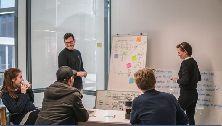
Day three allowed us to think practically and look at the technical feasibility of each solution.
User Testing:
After conducting three workshops, we were ready to test these ideas with users. We booked interview time with 10 people who fit into each archetype. Armed with rough paper prototypes in a wire-bound book and a set of questions, we conducted over 50 interviews to conduct Concept Validation.
After presenting the feedback from these interviews to the clients, they were able to make a decision on the direction of the product, which we could use to develop a proposed timeline for the next two releases of the product including design and development time.
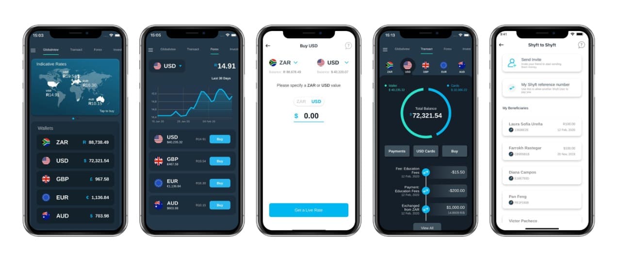
Design:
We spent the next two months designing the app to future-proof the design for the features to come, as well as design the new features. We started with Figma Wireframes developed with the client which we presented to our UI Designers and Product Owners to better understand technical feasibility. Our UI Designers got started working on designs while we tested Concept Acceptance with existing Shyft users through one on one interviews.
Once we had completed testing and our team had a clickable prototype, we presented back to the client and technical team. Sprint planning could now commence.
During the Development process, our team stayed on standby and were called in if designs needed to be changed for technical reasons. We became User Experience consultants as decisions needed to be made.
Even after the product has been launched, we work closely with the technical and support team to identify the most common customer experience issues and propose design and system changes to give the best user experience.
The new Shyft Update can be seen here.
Shyft was growing its user base and interest. Our client wanted to develop a concept for the next release of the app that could define an exciting roadmap for the product and give users a clear vision for what the value of the product was, and could be in the future.
Research period:
The Team started with what we knew, or could easily know. We spoke to the Shyft Customer Experience team about common problems customers were experiencing, requests for new features as well as their expert opinion as to where the product could go.
Scoping:
We conducted a 2-day-long Scoping session with the client to better understand their needs and expectations. It became clear that the client was ambitious and wanted us to look at international competitors not just in the Forex space but also at any new banking solution that was making waves.
Our scoping session was followed by a proposal; our assessment of how the 12-week engagement could work, what deliverables we could deliver and what steps we thought were necessary to produce our best work.
Competitor Research:
Our next step was to conduct more formal Desktop and User Feedback Sessions. We looked into dozens of international products, ranging from Marcus to Acorn and RobinHood. By studying how these products developed, we could start thinking about Shyft’s roadmap as a product. We also started talking formally to Shyft Users, conducting interviews, setting up surveys to be sent to the existing database, friends of the product who wouldn’t mind sitting with us for hours at a time and people who were Shyft’s target market but had never used the product.
Ideation:
Once we presented these findings to the client, we could set up a series of Ideation Workshops. These sessions were structured around Shyft personas; archetypes which we had put together based on interviews, how they used Shyft, which features they used as well as data from the Shyft database (collected for us by Shyft’s data scientist at Standard Bank). We took two personas at a time and ideated blue sky concepts of where Shyft could be in the future for these users. These often fell into a template of:
Persona x needs…..to….in order to….
Day two of these ideation workshops with the entire client team (12 people in total) took these ideas and broke them down into features. We then asked our key decision-makers to prioritise these features by what they thought would bring the biggest value to this user and the business.
Day three allowed us to think practically and look at the technical feasibility of each solution.
User Testing:
After conducting three workshops, we were ready to test these ideas with users. We booked interview time with 10 people who fit into each archetype. Armed with rough paper prototypes in a wire-bound book and a set of questions, we conducted over 50 interviews to conduct Concept Validation.
After presenting the feedback from these interviews to the clients, they were able to make a decision on the direction of the product, which we could use to develop a proposed timeline for the next two releases of the product including design and development time.
Design:
We spent the next two months designing the app to future-proof the design for the features to come, as well as design the new features. We started with Figma Wireframes developed with the client which we presented to our UI Designers and Product Owners to better understand technical feasibility. Our UI Designers got started working on designs while we tested Concept Acceptance with existing Shyft users through one on one interviews.
Once we had completed testing and our team had a clickable prototype, we presented back to the client and technical team. Sprint planning could now commence.
During the Development process, our team stayed on standby and were called in if designs needed to be changed for technical reasons. We became User Experience consultants as decisions needed to be made.
Even after the product has been launched, we work closely with the technical and support team to identify the most common customer experience issues and propose design and system changes to give the best user experience.
The new Shyft Update can be seen here.